- PROJECT CASE STUDY -
Whakaora Kai
(previously Food Rescue Northland)
- Brand Design Overhaul
- Illustration
- Vehicle & Building Signage
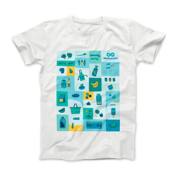
- Apparel items
- Website Design
- Social Media Graphics
- Assorted print media
Zero waste. Zero hunger.
155 Whakaora Kai, are on a mission to reduce methane emissions by preventing food waste.
They partner with growers, suppliers and retailers across the Taitokerau (Northland) region, collecting surplus food and giving it to more than 80 organisations that can share it with their communities.
Brand Overhaul
155 Whakaora Kai - previously known as Food Rescue Northland, needed to be brought into alignment with its parent organisation, 155 Whare Awhina.
The infinity symbol was reimagined. An evolution from the existing single infinity loop; to a double loop to signify the interaction between two cultures, as well as the giving and receiving, and the life cycle of food rescue.
A koru form was created, providing the link to Whare Awhina's koru, as well as signifying new beginnings with the food rescue ethos. Woven together like a kete, connecting and weaving at the joins of the koru - symbolising togetherness and simply, the idea of a food basket. Simplified, geometric stylised lines are inspired by the binding & symbolism of the toki.
There was careful consideration with the colours chosen to reflect Whakaora Kai - navy blue for strength coupled with green & blue teals inherited from Whare Awhina.
Type placement is in the same typeface, format and size hierachy as Whare Awhina - providing a subtle connection and cohesion between the two brands.
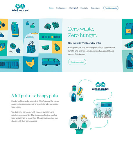
Redesigning and rebuilding a website
The original Food Rescue website was dated and tired, and needed a full redesign as Whakaora Kai to not only bring it into brand alignment but also with user experience and optimised for mobile devices. The site content and structure was planned, written and optimised for SEO performance with Pippa Jayne Communicatons, which allowed me to focus on making sure all the design pieces fit together – team work at its finest!
With many aspects to the organisation, and connection to Whare Awhina, we had to communicate and display the information in an easily digestible way while working with two target audiences - food suppliers and supporters (recipient organisations to share out the surplus food).
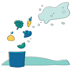
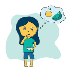
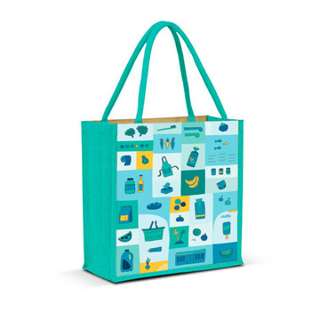
Custom illustration was created to add visual impact, and helped to connect the new brand and colour palette. The limited tonal colours create an easy-to-recognise bespoke illustration.
Colour significance
Neutral green turquiose and teal blue colours with a touch of blues make up the brand. These are an extension from the current Whare Awhina brand. Turquoise greens chosen for freshness, balance, a visual 'green' approach to recycling food, and environmentally connotation-free colours.
Navy blue, rather than 155's purple, has been chosen for depth and more cohesive balance of colour overall. Navy blue gives a calm yet strong and centered base - the strength and support people need within food uncertainty.
Yellow brings a small touch of an accent colour, bringing life, fun and happiness into the brand - uplifting the feeling from food waste to sharing kai (food).
The colours can be broken down into lighter tints, which can be used for tonal illustrations and other uses.

