- PROJECT CASE STUDY -
Riverside Escapes, Northland
- Brand Design
- Signage Design
- Rocketspark Website
Web Design and Branding
Sometimes when you build a DIY website, there's only so much you can achieve... and that's when the girls from Riverside Escapes reached out, requesting a web audit to pinpoint what they could do better.
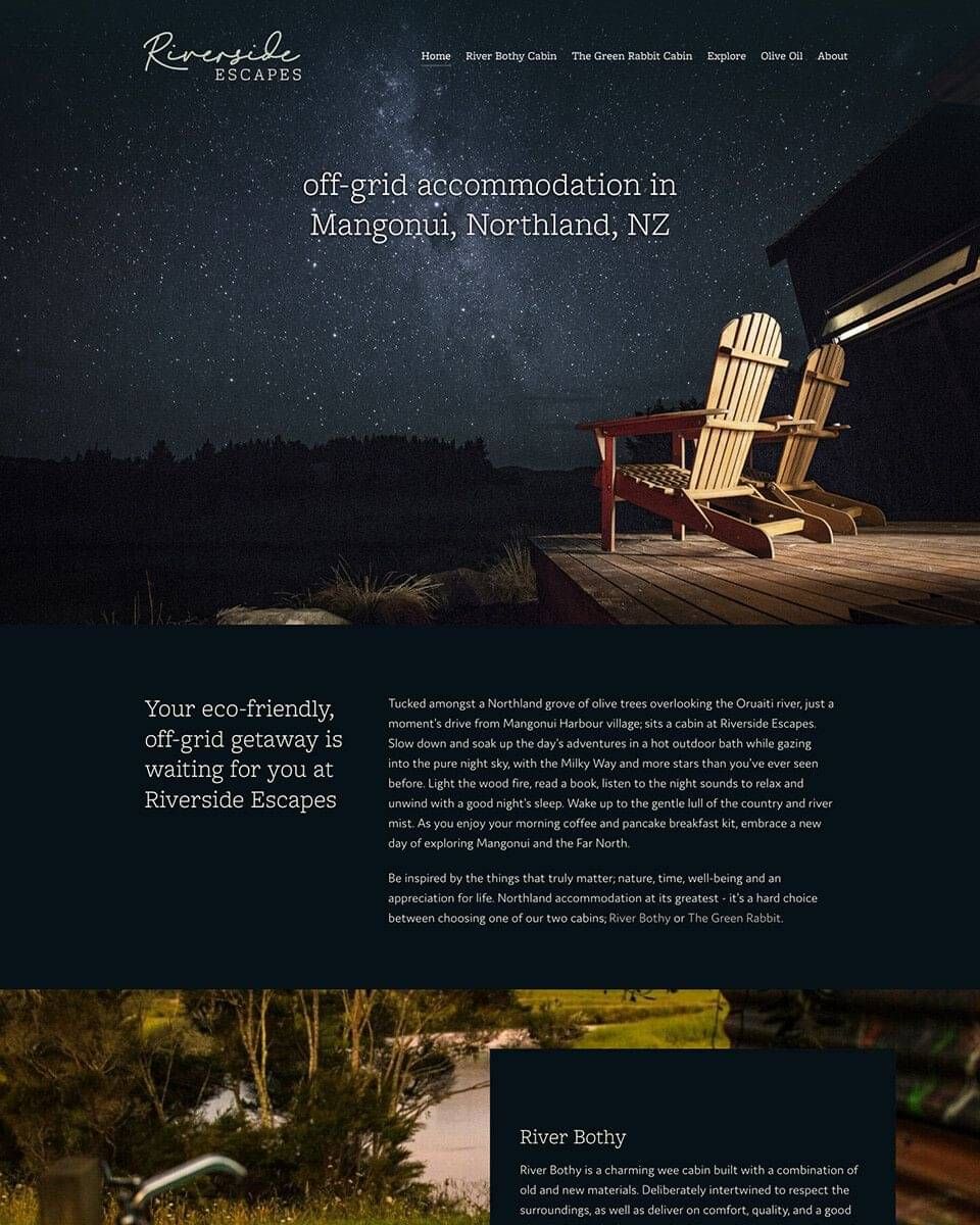
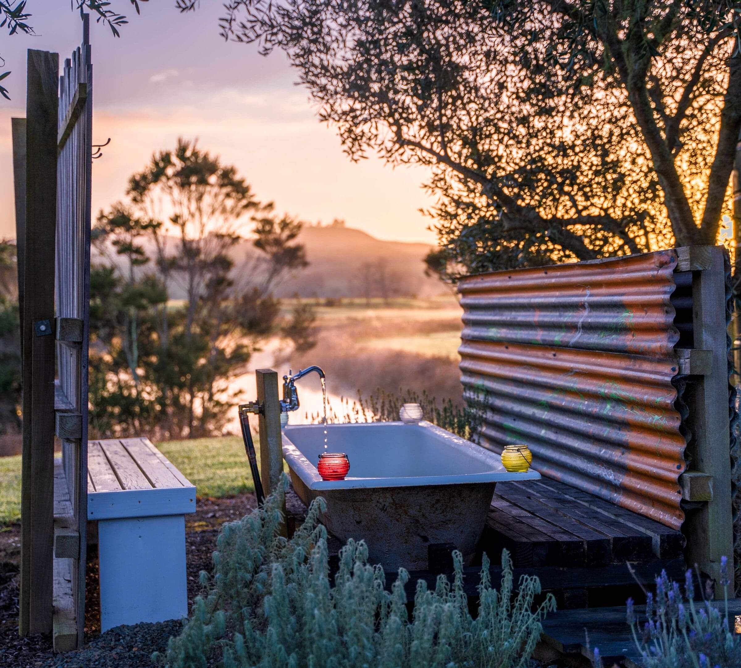
I popped over to visit in person, and was blown away by the location and quality of accommodation - an overcast morning didn't let the beauty of the river mist, settling amongst the multitude of olive trees, from showing through. What started as a web audit rolled out to a complete site rebuild and redesign; a brand style and logo design; signage & marketing materials, to bring it all together.
The Brand
The existing logo was generated purely by text on the webpage, and wasn't being used to its full potential across other media.
A redesign of the logo, hinted at two key elements - the river, which of course, is a feature at Riverside Escapes, and a nod to being on a holiday and typing a letter or itinerary, in the typewriter style the girls love. A little bit of strategy behind the logo, makes sure that it's going to be one that gives people a desire to be on a getaway, as well as incorporating the feel of the area.
The Redesigned Website
After a full web audit, highlighting some helpful improvements, Maggie & Brooke requested a redesign of their website built on the Rocketspark platform. This was to enable full advantage of some great features including better SEO management, easier content editing for them, and more importantly - a site that made the viewer book a stay!
With an incredible collection of photographs and videos readily available from talented photographers & videographers, I really wanted to make sure they were the focal point throughout the site. After all, a picture speaks a thousand words.
Calls to actions, highlighting the two eco-friendly off-grid cabins in all their glory, and bringing in a new suite of branding colours to really set the tone.
The site was the overall Best Brand and Best Client Impact 2021 award winner, with Rocketspark's Partner websites.
You can see the Before/After of the web project here.
Thanks so much Nat. This is fantastic!
We love the Explore page – brilliant!!
Maggie.
Explore Northland
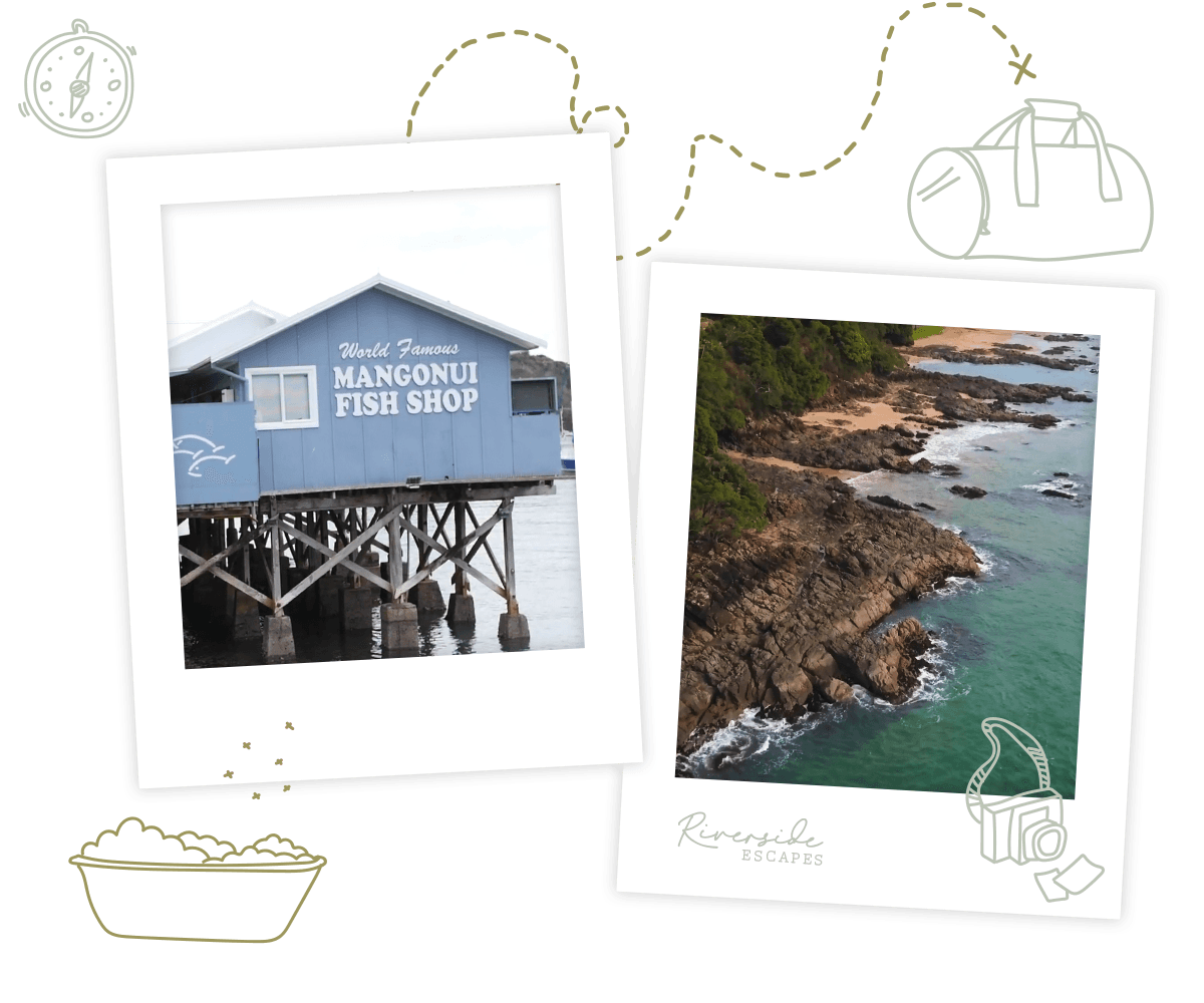
There was an opportunity within Riverside Escape's site to REALLY add a point of difference - the "Explore" page.
Created as an itinerary for guests to maximise their stay, I added custom illustrations and polaroid photos to evoke that sense of travel and adventure.
This page serves two purposes - one as an itinerary, and the second, a reason to help guests learn more about the North and stay longer!
The webpage is still completely branded, with a video and information - as well as a custom layout on paper to enhance the idea of pen drawings and polaroids collected along the trip.
Branding Colour
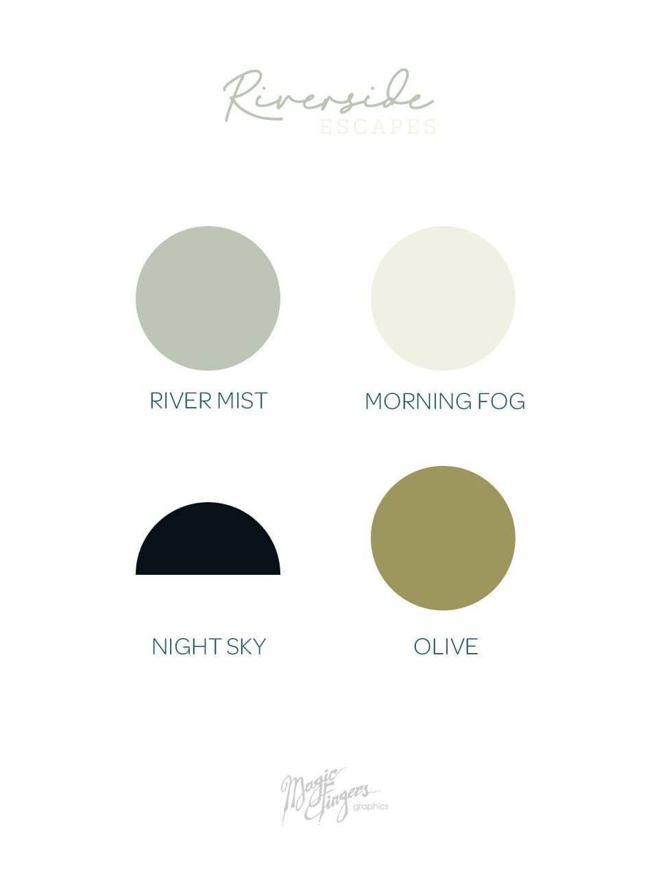
Evoking a sense of nurture and nature, with rest and relaxation was the goal of a colour palette. Inspired from the olive grove greens and the starry night sky, an earthy toned palette was created.
This enables Riverside Escapes to have a consistent brand presence over everything that they do, from website edits to social media, and anything printed - it'll all be on brand.
Business Cards
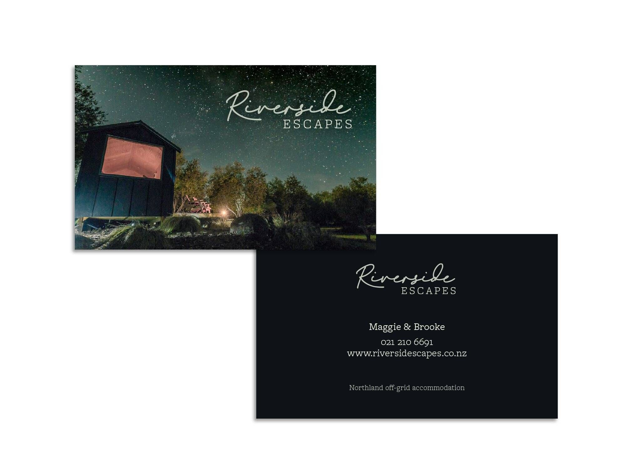
New business cards designed, this will make networking in the area easier, as well as leaving a couple of cards out for guests to take home from their stay.
Cabin Info Guides
Both The Green Rabbit and The River Bothy cabins have a wee information guide, covering off general housekeeping, safety, and access codes. When I built the website and added a stylised "Explore" itinerary section, Riverside Escapes were keen to add this into the info guide, as well as some local spots, seeing as the mobile data access is limited in the area.
I designed new cabin info booklets with the new branding and stunning photography, as well as the "Explore" illustrations dotted throughout; keeping their marketing pieces looking consistent.
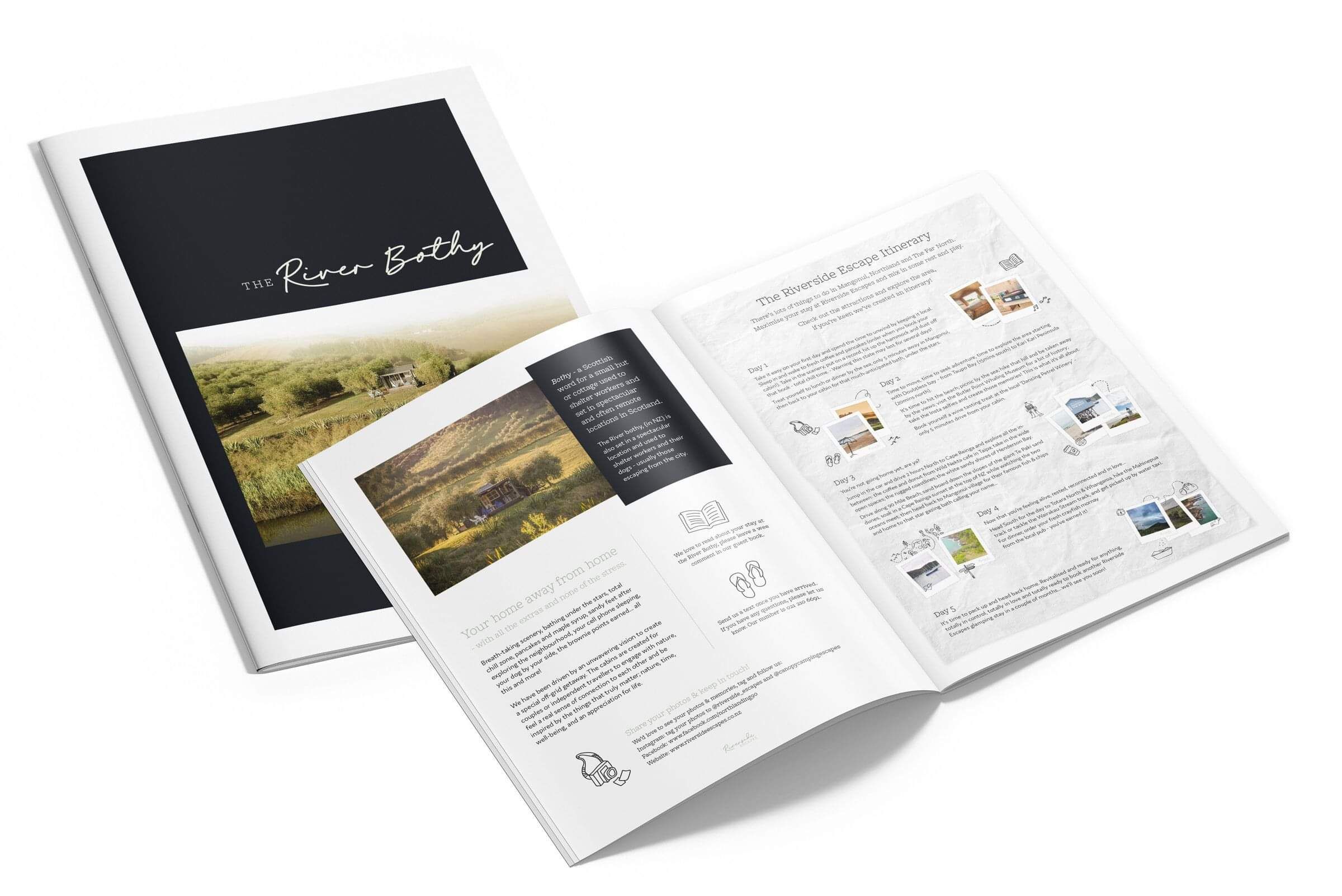
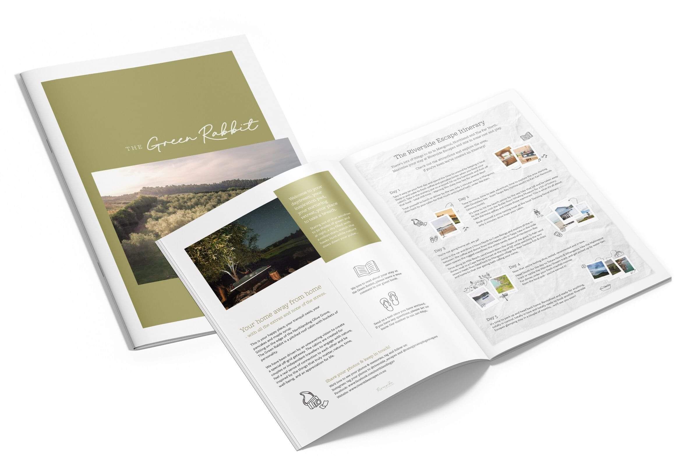
Having a consistent presence of the brand and marketing materials elevates a guest's experience. From a quick DIY solution of information, to a booklet that is transformed with branding and thoughtful placement of content, text and images; it shows a greater attention to detail and care.
Corten Steel Signs
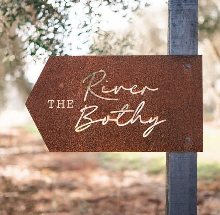
Arriving to a luxury accommodation site means first impressions count! Adding signage for guests upon arrival was suggested in the brand & web audit, and it was decided to go with corten steel signs.
Corten steel is an architectural rusting steel that is designed to rust. To prevent the core of the steel from deteriorating and completely rusting out, it has copper in it and lasts a long time. As the steel ages over time, the copper-orange colour of the rust progresses and will naturally contrast with the green tones surrounding it.
Impact of the branding and website
Riverside Escapes could have been hit hard during COVID and the restrictions on businesses throughout 2020 in NZ. However, once lockdown was lifted, people were eager to escape and bookings started flying in.
The dynamic duo are juggling their other business, in rental property management, as well as Riverside Escapes. There are times when they struggle to book time off because accommodation bookings are so consistent!
With approx 75-85% occupancy during 2020, at times 100% for a few of weeks, it's safe to say that the redesign in branding and website strategy has paid off.
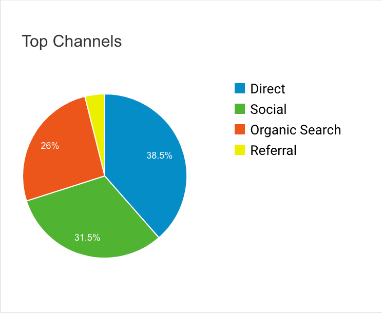
Creating a bigger presence online with social media and increasing their posting of photos and brand inspired content - eg: stylised quotes, branding and adding more about their ability to host dogs too - has generated more followers and general awareness of their location and accommodation offering.
"Since the new website went up, we're sitting at 75-85% occupancy. Even after Lockdown! It's unreal.
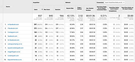
Knowing where our bookings are coming from and how many visits our sites get is such valuable info."
Brooke.
