- PROJECT CASE STUDY -
The Lovers Photography
- Brand Design & Strategy
- Rocketspark Website
- Custom Illustration
- Print media design

Nara Maw is the creative woman behind the camera and The Lovers Photography, a wedding photography business based in Northland. She is inspired by real people and how love is beautifully unapologetic.
Nara photographs those loved-up couples in elopements, weddings, engagement photoshoots, and couples sessions.
The Rebrand
Nara approached me to create her rebrand - The Lovers Photography. She wanted to connect to her target audience of couples in wedding photography, moving away from her previous personal brand, Nara Maw Photography.
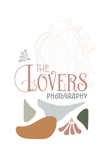
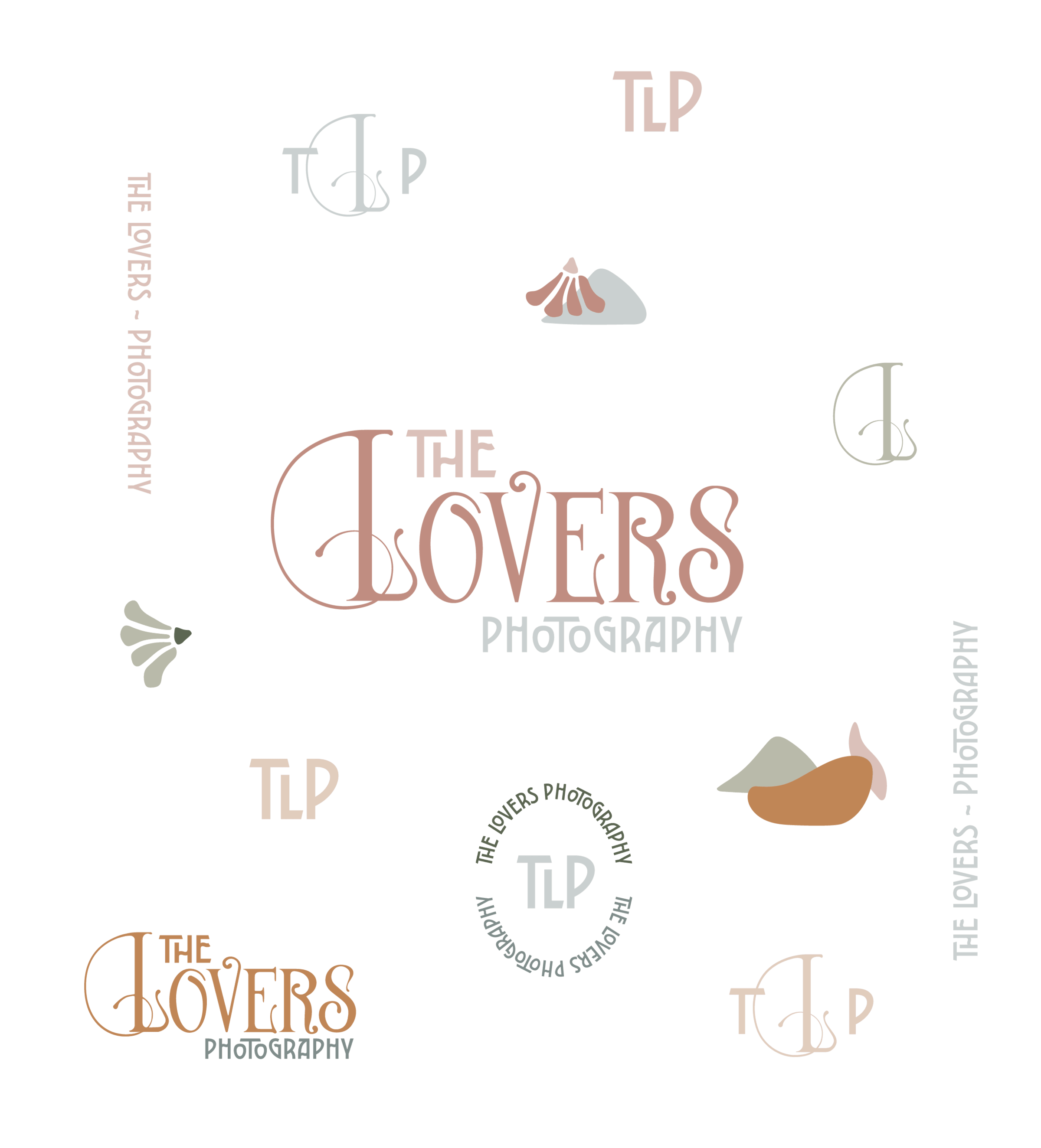
With a vision to bring in some feminine and flowing Art Nouveau inspiration, we decided to play on creating an image of a couple and the connection in love, and some playful inspired elements to build the brand suite.
Researching the Art Nouveau movement showed the muted, natural colours that depicted women and figures, enveloped in organic matter - flowers, plants and vines. Flowing hair, flowing nature are what inspired the design of the illustrated couple and the organic shapes that support the brand.
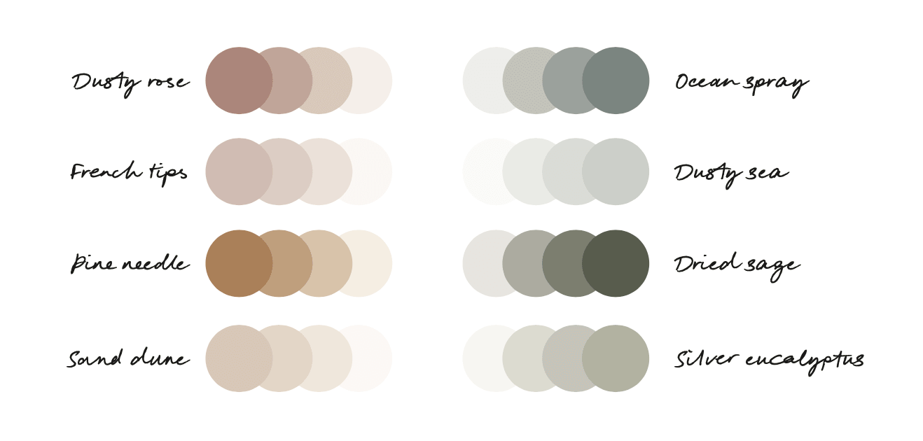
Colour Palette
Earthy muted tones all drawn from art nouveau pieces - carefully chosen and balanced to compliment each other.
These tones are seen in Nara's photographic work too - flowers, landscapes, beaches, wedding and bridal party outfits and within floral bouquets.
Nara's initial request was a black and white brand - however to stand out in a sea of B&W photographer portfolios and emotionally connect to her target audience, it was important we went beyond that!
The Redesigned Website
With a renewed brand vision, the website was in for a complete overhaul! Utilising brand elements to float in the background of the page, provided a subtle layer to contrast and help the photographs stand out.
Arches, curved corners and poster type styled headings are a nod to the Art Nouveau movement with a digital take. I wanted to create a timeless, elegant design that stood out amongst the sea of black and white photography portfolios that tend to lack colour. Using coloured type in unusual Art Nouveau typefaces helped connect the brand.
Nara wrote her own content, exploring a poetic way to capture the feeling of love and couples excited for their wedding day.
WIth clear calls to action, subtle custom illustration, creative font choices and elegant design helped this site win Rocketspark's Site of the Month in Jan/Feb 2023.
Business Cards and Keepsake Boxes
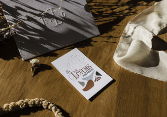
New business cards designed, this will make connecting to people in the area easier, and can go out into packages.
These cards have been letterpress printed, allowing for a tactile feel on the debossed logo and lettering.
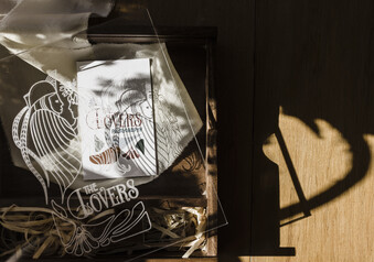
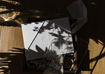
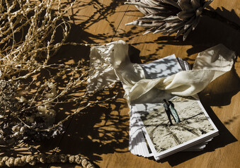
The Keepsake boxes have a beautiful etched perspex cover - a subtle branding opportunity that doesn't take away from the memories the couple receive.
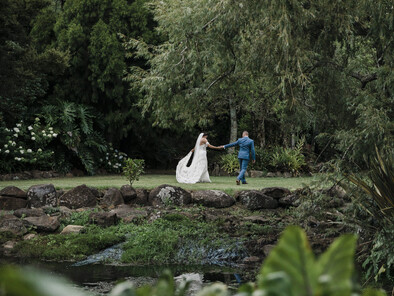
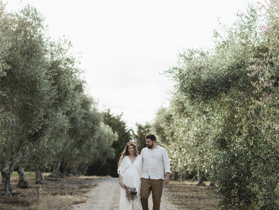
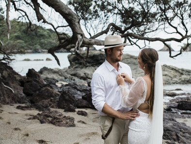
Photos by Nara, of course!
"I don't think I can find the words to articulate just how amazing the whole process was working Natalie on my rebrand and website build. My brand and website as a whole is true perfection, Natalie was incredible and deciphering my brain vomit! My brand/website is 100% a reflection of my business and feel so blessed to have found Natalie!"
Nara.
